> ## Documentation Index
> Fetch the complete documentation index at: https://docs.zbdpay.com/llms.txt
> Use this file to discover all available pages before exploring further.
# Themes Customization
> Customize every visual element of ZBD Ramp to match your brand
ZBD Ramp provides complete control over the widget's appearance through an advanced theming system. Customize every visual element to create a seamless brand experience.
## Theme Options
### Pre-built Themes
Start with our professionally designed themes:
Clean, bright interface perfect for daytime use and professional applications
Modern dark interface that reduces eye strain and saves battery on OLED screens
## Live Preview Editor
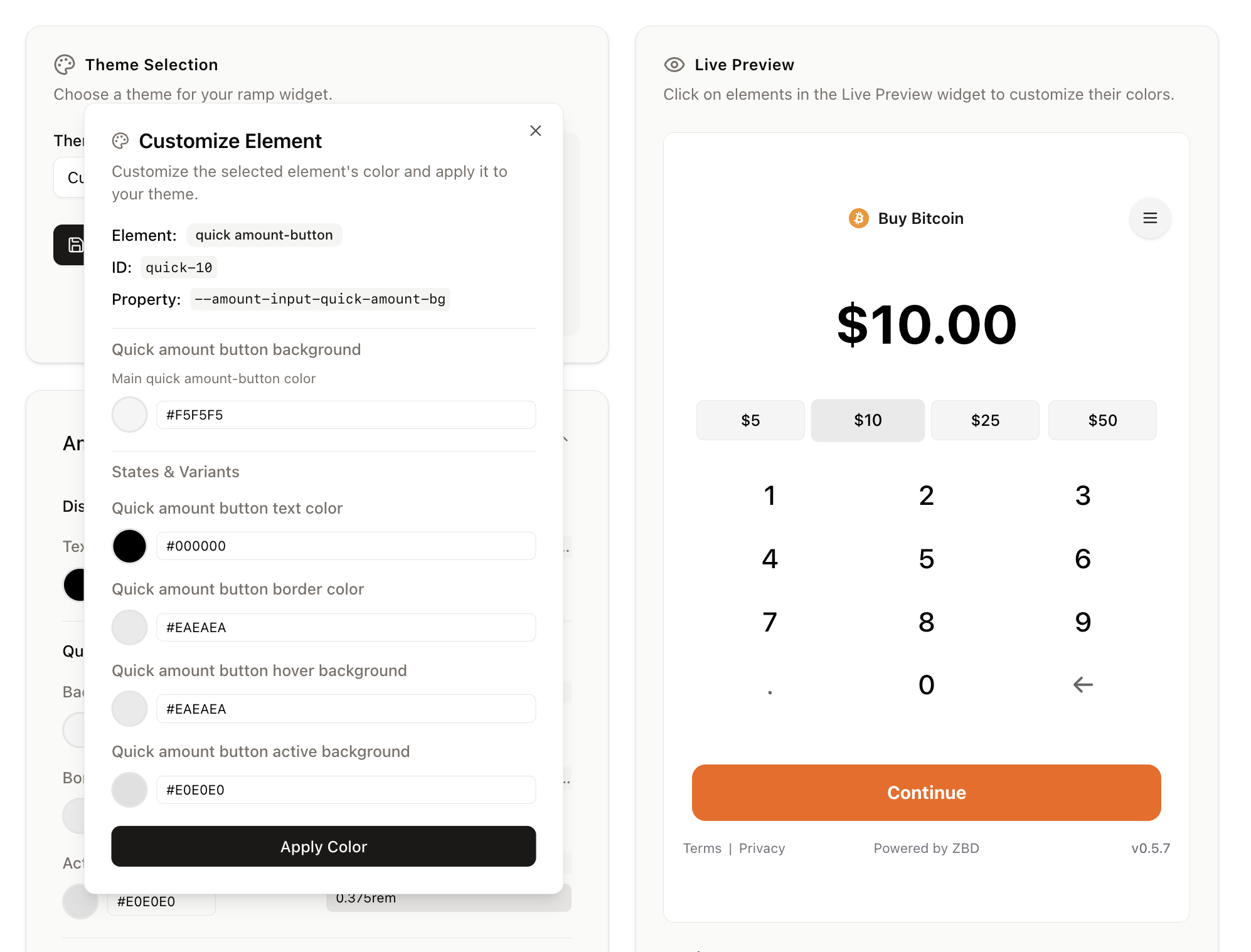 The ZBD Developer Dashboard features a powerful Live Preview editor that makes customization intuitive and immediate.
### How It Works
Navigate to Ramp → Theme in your ZBD Developer Dashboard
Click directly on any element in the preview to select it
Adjust the element's properties in the side panel
Watch your changes apply in real-time
Save your custom theme when satisfied
### Customizable Properties
For every element in the widget, you can customize:
* **Background Color**: Primary background color
* **Text Color**: Primary text color
* **Border Color**: Element border color
* **Border Radius**: Corner rounding
* **Hover Background**: Background color on hover
* **Hover Text**: Text color on hover
* **Active Background**: Background when clicked/active
* **Active Text**: Text color when active
* **Disabled State**: Appearance when disabled
* **Shadow**: Box shadow effects
* **Padding & Margins**: Spacing adjustments
## Custom Theme JSON
Every theme configuration is exportable as JSON, allowing you to:
* Version control your theme
* Share themes across projects
* Backup theme configurations
* Programmatically apply themes
### Example Theme JSON
```json theme={null}
{
"name": "My Custom Theme",
"base": "light",
"variables": {
"--primary": "210 100% 50%",
"--primary-foreground": "0 0% 100%",
"--secondary": "210 40% 96%",
"--secondary-foreground": "222 47% 11%",
"--accent": "210 40% 90%",
"--accent-foreground": "222 47% 11%",
"--destructive": "0 84% 60%",
"--destructive-foreground": "0 0% 100%",
"--border": "214 32% 91%",
"--input": "214 32% 91%",
"--ring": "210 100% 50%",
"--radius": "0.5rem",
"--widget-background": "#FFFFFF",
"--widget-card-background": "#FAFAFA",
"--amount-input-display-text": "#000000",
"--amount-input-display-error": "#ef4444",
"--amount-input-quick-amount-bg": "#F5F5F5",
"--amount-input-quick-amount-text": "#000000",
"--amount-input-quick-amount-border": "#E0E0E0",
"--amount-input-quick-amount-hover-bg": "#EEEEEE",
"--amount-input-quick-amount-active-bg": "#E0E0E0",
"--amount-input-numpad-bg": "transparent",
"--amount-input-numpad-text": "#000000",
"--amount-input-numpad-hover-bg": "#F5F5F5",
"--amount-input-numpad-active-bg": "#EEEEEE",
"--button-primary-bg": "210 100% 50%",
"--button-primary-text": "0 0% 100%",
"--button-primary-hover-bg": "210 100% 45%",
"--button-primary-active-bg": "210 100% 40%",
"--button-secondary-bg": "210 40% 96%",
"--button-secondary-text": "222 47% 11%",
"--button-secondary-hover-bg": "210 40% 92%",
"--button-secondary-active-bg": "210 40% 88%"
}
}
```
### Importing/Exporting Themes
#### Export Your Theme
1. Open the Theme editor in your dashboard
2. Click "Export Theme" button
3. Copy the JSON or download as a file
#### Import a Theme
1. Open the Theme editor
2. Click "Import Theme"
3. Paste your JSON or upload a file
4. Preview and apply
## Version Control Integration
### Best Practices
1. **Store in Repository**: Keep your theme JSON in your project repository
2. **Use Environment Configs**: Different themes for dev/staging/production
3. **Document Changes**: Comment significant theme updates
4. **Test Across Devices**: Ensure theme works on all screen sizes
## Testing Your Theme
Always test your custom theme across different devices and browsers to ensure a consistent experience.
## Support
Need help with theme customization?
* Use the Live Preview in your [ZBD Developer Dashboard](https://dashboard.zbdpay.com)
* Contact your ZBD account manager for advanced customization
* Review our example themes in the dashboard
The ZBD Developer Dashboard features a powerful Live Preview editor that makes customization intuitive and immediate.
### How It Works
Navigate to Ramp → Theme in your ZBD Developer Dashboard
Click directly on any element in the preview to select it
Adjust the element's properties in the side panel
Watch your changes apply in real-time
Save your custom theme when satisfied
### Customizable Properties
For every element in the widget, you can customize:
* **Background Color**: Primary background color
* **Text Color**: Primary text color
* **Border Color**: Element border color
* **Border Radius**: Corner rounding
* **Hover Background**: Background color on hover
* **Hover Text**: Text color on hover
* **Active Background**: Background when clicked/active
* **Active Text**: Text color when active
* **Disabled State**: Appearance when disabled
* **Shadow**: Box shadow effects
* **Padding & Margins**: Spacing adjustments
## Custom Theme JSON
Every theme configuration is exportable as JSON, allowing you to:
* Version control your theme
* Share themes across projects
* Backup theme configurations
* Programmatically apply themes
### Example Theme JSON
```json theme={null}
{
"name": "My Custom Theme",
"base": "light",
"variables": {
"--primary": "210 100% 50%",
"--primary-foreground": "0 0% 100%",
"--secondary": "210 40% 96%",
"--secondary-foreground": "222 47% 11%",
"--accent": "210 40% 90%",
"--accent-foreground": "222 47% 11%",
"--destructive": "0 84% 60%",
"--destructive-foreground": "0 0% 100%",
"--border": "214 32% 91%",
"--input": "214 32% 91%",
"--ring": "210 100% 50%",
"--radius": "0.5rem",
"--widget-background": "#FFFFFF",
"--widget-card-background": "#FAFAFA",
"--amount-input-display-text": "#000000",
"--amount-input-display-error": "#ef4444",
"--amount-input-quick-amount-bg": "#F5F5F5",
"--amount-input-quick-amount-text": "#000000",
"--amount-input-quick-amount-border": "#E0E0E0",
"--amount-input-quick-amount-hover-bg": "#EEEEEE",
"--amount-input-quick-amount-active-bg": "#E0E0E0",
"--amount-input-numpad-bg": "transparent",
"--amount-input-numpad-text": "#000000",
"--amount-input-numpad-hover-bg": "#F5F5F5",
"--amount-input-numpad-active-bg": "#EEEEEE",
"--button-primary-bg": "210 100% 50%",
"--button-primary-text": "0 0% 100%",
"--button-primary-hover-bg": "210 100% 45%",
"--button-primary-active-bg": "210 100% 40%",
"--button-secondary-bg": "210 40% 96%",
"--button-secondary-text": "222 47% 11%",
"--button-secondary-hover-bg": "210 40% 92%",
"--button-secondary-active-bg": "210 40% 88%"
}
}
```
### Importing/Exporting Themes
#### Export Your Theme
1. Open the Theme editor in your dashboard
2. Click "Export Theme" button
3. Copy the JSON or download as a file
#### Import a Theme
1. Open the Theme editor
2. Click "Import Theme"
3. Paste your JSON or upload a file
4. Preview and apply
## Version Control Integration
### Best Practices
1. **Store in Repository**: Keep your theme JSON in your project repository
2. **Use Environment Configs**: Different themes for dev/staging/production
3. **Document Changes**: Comment significant theme updates
4. **Test Across Devices**: Ensure theme works on all screen sizes
## Testing Your Theme
Always test your custom theme across different devices and browsers to ensure a consistent experience.
## Support
Need help with theme customization?
* Use the Live Preview in your [ZBD Developer Dashboard](https://dashboard.zbdpay.com)
* Contact your ZBD account manager for advanced customization
* Review our example themes in the dashboard